
Psychology Says the Colors You Reach for After 40 Reveal These 8 Things About You


Somewhere around your forties, something shifts. Maybe you walked past the beige sweaters you used to live in and picked up a coral one without thinking.
Maybe you repainted the bedroom a deep forest green and felt oddly at peace. Or maybe you realized every single thing you bought this year was navy.
These choices aren’t random. Psychologists who study color preference have found that we’re drawn to colors partly because of what they remind us of and how they make us feel.
As our priorities, bodies, and even our eyes change with age, the colors we reach for tend to change too.
Below are eight things your color choices after 40 may be telling you, what the research actually supports, and how to use that knowledge on purpose.
1. Reaching for Navy, Grey, and Soft Neutrals: You’ve Started Protecting Your Peace

A wardrobe full of calm, easy-to-match shades often reflects a bigger life shift. Stanford psychologist Laura Carstensen’s socioemotional selectivity theory describes how people tend to invest more in emotional well-being and less in novelty as they get older. We get pickier about what drains us.
Quiet colors help with that. They reduce the number of decisions you make each morning, they rarely clash, and they don’t demand attention. Choosing them can be a sign you’ve decided your energy is better spent elsewhere.
Try this: Keep your calm base, but add one “joy piece” per outfit or room (a scarf, a cushion, a mug) so calm doesn’t slide into flat.
2. Suddenly Loving Bold Reds, Fuchsia, or Cobalt: You’re Done Being Invisible
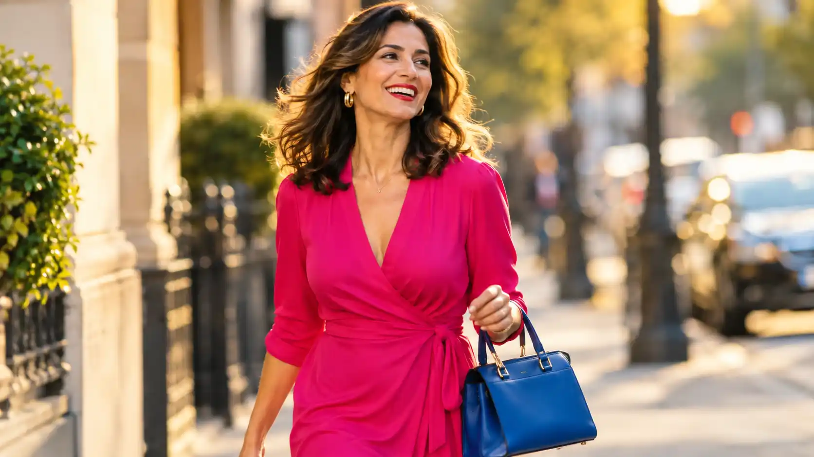
Many people, especially women, describe feeling less “seen” in midlife. A common response is a burst of bright color that says I’m still here.
There’s some science behind why this feels good. Studies on “enclothed cognition” suggest the clothes we wear, and what they symbolize to us, can influence how we feel and act.
The effect sizes are debated and not every finding has replicated, but the core idea holds up in everyday life: if a color makes you feel confident, you tend to carry yourself that way.
Try this: Wear your boldest color near your face (a top, lipstick, frames). It draws attention to your expression, which is where you want people looking.
3. Drawn to Greens and Earthy Tones: You’re Craving Grounding and Restoration

If your home is filling up with plants, sage walls, and clay-colored ceramics, you may be responding to a need for mental rest. Attention restoration theory, developed by Rachel and Stephen Kaplan, proposes that natural settings help us recover from the mental fatigue of constant focus.
Greens and earth tones carry strong associations with nature, so they can become visual shorthand for “breathe.” People juggling careers, teenagers, and aging parents at the same time often gravitate here.
Try this: Put your greenest corner where you actually decompress, like your reading chair or the view from your desk, not just the living room people see.
4. Loyal to Blue: You Value Stability, Trust, and a Steady Life
Blue is one of the most widely liked colors in preference research. One well-known explanation, the ecological valence theory from Stephen Palmer and Karen Schloss, is that we like colors linked to good things. Blue shows up in clear skies and clean water, so it earns positive feelings.
After 40, many people have built something worth keeping steady: a home, a family, a career, a friendship circle. Choosing blue again and again often mirrors a preference for reliability over drama.
Try this: Blue works well in bedrooms and workspaces. Pair it with warm wood or brass so it stays cozy rather than cold.
5. Choosing Soft Pastels: You’re Leaning Into Gentleness and Good Memories
Researchers have documented a “positivity effect” in older adults: as we age, we tend to pay more attention to, and remember more of, positive information. Soft, light colors fit this mood. They feel kind, optimistic, and a little nostalgic.
Pastels can also carry personal history. The mint of a childhood kitchen or the lavender of a grandmother’s garden can quietly pull you back to a comforting time.
Try this: Ask yourself where you first loved the color. Naming the memory often tells you what you’re really looking for, such as comfort, safety, or play.
6. Preferring Warmer, Brighter Shades: Your Eyes May Be Changing, Not Just Your Taste
This one is biology, not personality. The lens of the eye slowly yellows and becomes less clear with age, and it filters out more blue light.
Over the years, blues, purples, and some greens can look duller or harder to tell apart, while warm colors stay vivid.
So if you find yourself buying brighter clothes or turning up the warmth of your décor, part of the reason may be that those colors simply look better to you now.
Try this: Good lighting matters more after 40. Brighter, full-spectrum bulbs help colors look truer. Regular eye exams also catch changes like cataracts early.
7. Sticking With One Signature Color: You Finally Know Who You Are

Younger people often try on colors the way they try on identities. By midlife, many settle on a “signature,” a color friends associate with them instantly.
Psychologists call a clear, stable sense of self “self-concept clarity,” and research links it to greater well-being. A signature color is a small, visible sign of that clarity. You’re no longer asking what’s in style. You’re asking what’s you.
Try this: Build a mini-palette around your signature: one deep shade, one light tint, and one neutral that flatters both. Shopping gets much easier.
8. Living in Black: You Want Simplicity, Authority, or a Little Armor
Black is a color with many meanings, so the reason behind it matters. For some, it’s pure efficiency: it all matches, it looks polished, it’s done. For others, it signals authority and seriousness, which can matter in leadership roles many people step into in their forties.
And sometimes black is a way to hide. If you’re wearing it because you’d rather not be noticed, or because you’ve stopped enjoying how you look, that’s worth gently paying attention to.
Honest check-in: Ask yourself, “Do I choose black, or do I default to it?” Choosing it is style. Defaulting to it every day may be a signal to check in with your mood.
Quick Guide: What Your Palette May Be Saying
A Quick Reality Check on Color Psychology
Color psychology is fun and genuinely useful, but it isn’t a personality test. Research shows color preferences are shaped by culture, personal memories, lighting, and even what was on trend when you grew up.
Many popular claims (like “red makes you aggressive”) have produced mixed results when scientists tried to repeat them.
Treat the eight points above as questions to ask yourself, not labels. The real insight comes from noticing why a color pulls you in right now.
How to Use This Knowledge in Your Own Life
Start with a quick look around your closet or your main room and notice which two or three colors dominate. Then name the feeling each one gives you.
If there’s a feeling you want more of that’s missing, that’s the color to try next, starting small with a scarf or a pillow before committing to a sofa or a whole wall. And always check colors in your own home’s lighting before deciding.
The Bottom Line
The colors you reach for after 40 are a small window into bigger changes: what you value, what you need more of, and how your body is shifting.
Whether you’ve found peace in navy, courage in red, or rest in sage, the best palette is the one that supports the life you’re living now.
So next time you pick something up and think “I never used to wear this,” don’t brush it off. It might be the most honest thing you’ve said about yourself all year.